Exciting News! Our Logo Has a Fresh Look!
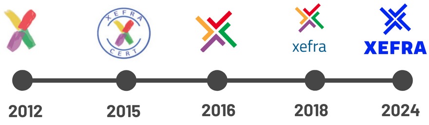
After more than a decade of proudly sporting our original logo, we’re thrilled to unveil a brand-new look! Our team has been hard at work crafting a modern, dynamic identity that reflects our growth, values, and commitment to excellence. As we’ve expanded our offerings and embraced innovative service delivery models, we felt it was time for a change. Our updated logo captures the essence of who we are today and where we’re headed to.
Our new logo boasts a sleek design, as it features clean lines, bold typography, and a vivid colour palette. It’s a visual representation of our evolution. The revamped logo inspires energy and vibrancy. We’ve retained the pictogram and the wording, as they symbolize our historical identity, but we’ve also introduced the vivid blue, adding a touch of vigour to it. It’s like a breath of fresh air!
We are happy to announce that you will start seeing our fresh logo across all platforms and materials, starting with our updated website, new company brochure, and all social media profiles. We have also changed the company preferred font to Barlow. This font will be used across all our communications, ensuring consistency, and reinforcing our unique style.
Rest assured, our commitment to quality and customer satisfaction remains unwavering. Join us in celebrating this important milestone and stay tuned for more updates as we roll out our new branding.
Thank you for being part of our journey!
Learn more about our logo evolution here.